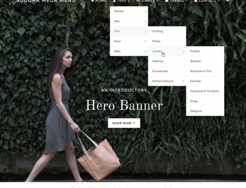
In WOO Canvas, the top navigation is, by default, aligned left and flush with the top of the browser. I wanted it floated right, down a bit, and custom styled. Here’s a screencast walking through the steps to make that happen.
I’m using the Canvas child theme Fresh Canvas so my Canvas upgrades don’t break anything. I also did a bit of custom styling for a single menu item using the CSS class in the WP menu system. Works like a charm.
Overview of Goals
- Float menu area right
- Force background color to “transparent”
- Top margin to push it down a bit, negative bottom margin to pull back up anything under that got pushed down
- Custom CSS for one menu item
- Styling for menu items: bold, larger font, color
Overview of Steps Involved
- Created Top Nav in menus.
- Assigned CSS class to the single menu item (e.g. “donate”). This is in the menu manager, Screen Options, show CSS class, then add what you’d like to call it.
- Top navigation background color to “transparent” (no quotes).
- Top nav background hover color also to transparent.
- Float top nav right. CSS: #top .nav { float:right; margin-top: 10px; margin-bottom: -10px;}.
- Background hover white: CSS: #top .nav li.current_page_item a { background: transparent !important; color: #fff; }
- For just that single menu item with the CSS class in the menu: CSS: #top .nav .donate { text-transform: uppercase; font-size: 14px; font-weight: bold !important; }
- I used a combination of CSS and the WOO admin options.


[…] You can also use custom links to link to outside URLs or a page that you might not have a WP link to e.g. Home. You could even use menus to add a bunch of links to outside sources and then easily list them in a sidebar. There’s also the Links (or Bookmarks) tool for this, but menus is another options to easily list a collection of sites. Drag and drop to reorder, no HTML, open links in new windows, even stylize with CSS. For a bit more custom styling, see WOO Canvas Top Nav Styling. […]
I’ve never used CSS before, but I was able to tweak this to move my main navigation up in line with my logo. I have been puzzling for days how to do this – thank you very very very much :-)
How do I centre it instead of putting it to the right? I tried ‘float: center’ but that didn’t work – in fact it cancelled out everything and put the menu back in its normal place!
I’ve solved it by aligning it left and giving it a wide margin. Which works OK, for what I’m doing. But would be good if it was possible to actually centre it
Hi Kirsty,
I’ve tried the same thing and centering never seems to work well (anywhere!). I’d do what you did. I wonder if something like ” margin-left: auto; and margin-right: auto; ” might work? Thanks for the comments.
Thanks, what got me was putting css styles in the main css file instead of custom.css
It’s weird that where you put it makes a difference, but I think different CSS files load in different order, so it does matter. Glad you fixed it.
Hey Bradley,
Unless I missed it, could you add a little bit more content to the page?
Could you put a text step by step with code examples?
A few of us don’t like to stop our day and watch videos, then transcribe the video to get something done.
I always SKIP videos in Google results because I just don’t like to use the time to:
Wait, watch, learn, transcribe and do.
I prefer to:
See, copy, adapt and do–much faster and I get much more done each day–too many things to do!
I accidentally got to this page because Google didn’t list it as a video and because of the title and content which I need.
Thank you,
Chris
Hey Chris,
Thanks so much for the honest feedback. I get about 50/50 people preferring videos or people preferring the write up. Best solution: do both, of course! I’m actually in your camp: because I usually know exactly what I’m looking for and I don’t need (or usually even want) to be hand-held through a process, I just want the code, copy it, paste it and see if it works. If it doesn’t work, I can come back and watch the video and see if I missed something.
So I just went through the video and manually transcribed what I thought were the relevant items and CSS and put them in the post above. Hope that helps. But I get your bigger request: I should do this all the time and I agree. So thanks for the nudge!
BTW I got what I needed on another page in seconds and got it going on the site in a few more seconds.
And I LOVE LOVE LOVE WOO!
Here’s to WOO! Woo hoo!
Hi Bradley,
I have found many of your posts about the place very useful – thank you!
This one appeared to be everything I was looking for. I am having a little trouble with it though because I wanted to have 2 items in my top nav – a logout and a My Account drop down. Problem is, soon as I put the margin-bottom at > -15px (ie. -50px would be ideal) the drop down menu wont show as it is hidden behind the header container and can’t be clicked. The header container in that far right zone is empty – is there a way to say the top nav must sit on top – ie. will css do layers???
Thanks so much.
Liz
I wonder if it matters to make your header container color background transparent? Nah, probably wouldn’t help. So I’m going to guess here that maybe the “z-index” might help. You ask if CSS has layers and this, as far as I understand it, is something like layers or at least “priority” of which layer should be on top of the other. Here are a few links, let me know if they help: The Z-Index CSS Property: A Comprehensive Look. CSS Tricks’ Z-Index.
[…] https://www.likoma.com/woo-canvas-top-nav-styling […]