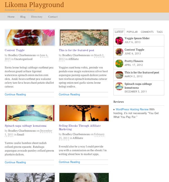
The post grid feature of the magazine template shows your posts in a 2-column “grid” layout with title, featured image, excerpt, and read more.
The grid option offers an alternative to the “blog” layout of a single column list of posts, usually with featured image on the left, easy-to-read title, excerpt and read more. With the grid, you can get more content into the same amount of real estate with smaller featured images and two columns.
Featured Image Sizes and Layout
An excellent feature of the grid layout is that it lets you change, on the fly, the image dimensions for the grid. From a small square (e.g. 75 x 75 pixels) or maybe a wider panorama shot (e.g. 300 x 100) that could be used for more impact.
Featured Posts and Grid … Confusion
These two elements (magazine’s Featured Posts and then the Post Grid) seem to be closely intertwined. For example, if you use a WOO Component widget to drag in the Post Grid, it seems to bring in the Featured Posts as well. Maybe it’s an oversight on my part, but the only way to them use only the grid would be to choose zero posts for the Featured Posts section in the Canvas theme settings.
You can also use the Widgets Template and then drag and drop the WOO Component widgets into that area and choose, for example, only the Magazine Grid. Then again choose zero Featured Posts and that page will just show the grid.
It takes a little getting used to, but once you get the hang of it, the magazine template and the posts grid can be a nice addition to showing off your work.

A magazine-style grid layout to highlight your latest posts in 2 columns.


Great tutorials Bradley.
Question – In the video the “Continue Reading” section with rule above and below are staggered throughout and don’t line up at the bottom of each row. Where as in the final screen shot they are all lined up uniformly. How did you do that ? or was it just by chance….
Mine are all scattered and it looks a bit messy I prefer each grid “square” to be exactly the same at the top and the bottom.
Many Thanks!
Hi Mary,
I know what you mean. When they’re lining up, it’s coincidence as far as I can tell. I admit that I like the staggered look sometimes, but when you don’t want it staggered, I end up either (1) manually change the amount of excerpt text or (2) fiddle with the CSS to try something like a fixed height … but that option pretty much breaks things. At this point, I’ll use something else completely: maybe a plugin. I’m actually working on another option for just about this thing and I’ll certainly write about here at WPU.
Thanks for stopping by!
[…] WOO Canvas Magazine Template Posts Grid (Jul 9) […]
Any thoughts on how to reduce the number of posts displayed in the grid?
As per my last comment I have created a gist to do this: https://gist.github.com/raisonon/6947974
Do you have any edits that allow you to do more columns? Like 3? I’m able to get the theme to generate 3 per row but when it goes tablet-responsive, the third block gets pushed below the second block instead of the first.
[…] WOO Canvas Magazine Template Posts Grid […]
Bradley, how can I turn off the post grid?
I notice the “Current Page Content” also gets a “Continue Reading” when it really doesn’t need one. Can this be turned off?
It looks like the “Magazine Posts grid” can be selective of what it posts, maybe you cover that in another video.
For our website I’m just allowed to add posts, pages to the site so there is a lot I don’t get to see that I would normally see if I had full access.
Thanks for the video’s!!
Rick