Since WOO Canvas version 5.0, the theme has been responsive. (What the heck is responsive?) Great, works really well, looks great on different sized screens, thanks WOO!
But web designer kind of guy that I am, I’m going to tweak, edit, alter, update, fix, and change certain elements of the design. If I don’t change too much, structurally, the responsive design should remain intact, but if I start going overboard, I might “break” some of those responsive features. At some point, with certain sites, it was just easier to turn off all responsive behavior and let the site look how it look on all devices.
Pre-version 5.0.10, that took some tinkering and even then it didn’t work all that well. Now with WOO Canvas version 5.0.10, they have just a simple bit of CSS code to insert and voilà: responsive design is gone. Thanks WOO!
Here’s the code you need:
@import url(css/layout.css); .col-full, #wrapper { max-width: 960px; width: 960px; } #top select { display: none !important; }
Insert the @import rule at the very top of the custom.css file, otherwise it will not work. You’ll need to change the 960px if you have changed the width of your site in the options panel (e.g. 940 or 1080).
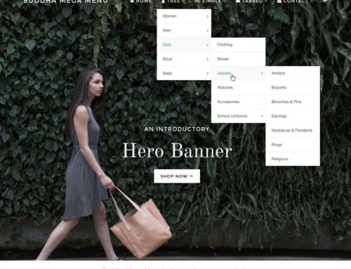
In case you were wondering, my main gripe was how the design treated the Top Navigation. It turned it into a drop-down menu that looked out of place and wasn’t very easy to use (especially on a phone).

Responsive WOO Canvas Top Nav
Update: Since Canvas 5.0.13, there’s an even easier update, just a big of code into your Canvas or Canvas child theme functions.php file:
add_action( 'init', 'woo_load_responsive_design_removal' );


Thank you Bradley for this tip! I love the Canvas theme, but the responsive part was giving me a headache on my mobile devices. Much better now.
I’m sure it’ll just get better and better. They keep updating Canvas over at WOO. It gets the most attention of all of their themes.
[…] WOO Canvas is Now Responsive! But what if I don’t want responsive? […]
I dont want this site to be responsive as well, but this is Mystile whoo. I tried both options and they don’t work. Can you help? Thank you so much
Hi Andrea,
I don’t know the Mystile theme. Have you tried submitting a help ticket? I see someone asked the same question here, but I don’t see a response yet.
I’m using Canvas 5.5.7, and found setting Enable Fixed Mobile Layout in General Layout. Checked the box, and now mobile devices show same as desktop version.
Thanks, Mark. Yes, since version 5.0 or so it’s been much better and they keep improving it. You check the box to make it not responsive but even that didn’t always do the trick, so hopefully it’s working well now. Sounds like it is!
Just a quick addition. An older client of mine still using Canvas 5.0.10 wanted to remove responsive features and I found that mobile devices loaded the page fully zoomed in so I had to remove the viewport meta tag. I added this line to the theme’s functions.php:
remove_action(‘wp_head’, ‘woo_load_responsive_meta_tags’, 10);