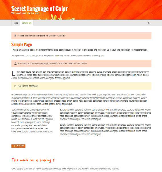
A site built and designed in 24 minutes?
From empty to full-width image header, navigation design, custom Google fonts galore, shortcode buttons, 1/3 and 2/3 columns, info boxes, a call to action, even a drop cap. Crazy, I know.
Get your popcorn. This site is built before your eyes. Will it win awards? No. Is it finished? No. Will you be able to build your site in 24 minutes? Sure!
You’ll get a glimpse into how Canvas works, what it can do, how quickly we (that means you, too) can build a site with zero code and only clicking and configuring.
So Mr. WPU, what’s your point?
As I’m sure you’ll gather from the video, this is a test. I’m just playing around. I wanted to see how long it would take me to get something of a design up and running starting from scratch–but starting with an advantage: I’m using WOO Canvas. It’s not just any theme. It’s a powerhouse. In 24 minutes, I’m barely scratching the surface of what it can do–and what it can do without code. I also had pretty much zero design direction, just winging it. But in that time we built, designed and configured:
- Full-width header with background image
- Google web font selection for the site title and site description
- Primary navigation color, background color, hover over background and text color, even dividers
- Page and post title font selection and color
- Heading 2 and heading 3 font selection and color (not to say they were, uh, good choices … )
- Info boxes (2 types)
- A 3-column layout with first column at 1/3 width and second at 2/3 width
- A call to action button
- A drop cap (that large letter at the beginning of a paragraph)
I’m also doing this because I want to make a habit of it: see how much you can do in so little time with Canvas. It’s going to get better.

24 minutes to build a site? Just watch.


[…] WOO Canvas Website in 24 Minutes (Sep 11) […]
Did you ever figure out why the slider didn’t work?