Keeping things stark, clean, and lean for this architect’s site.
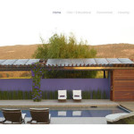
Using the power of the architectural work and leaving the design minimalist lets visitors to W+ Design Studio’s new site focus on their work (not the website’s fancy features).
In fact, we’re keeping “fancy features” out of the way with this site and only using simple sliders (changing images) and a few built-in WordPress slideshows to show the work. Simple page structures to organize and then a column layout and Jetpack slideshow.
[quote]If you’ve got the goods, show them off.[/quote]
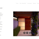
I think the Napa Poolhouse is my favorite. ;-)
- Large image slider on home page.
- Simple slideshow.
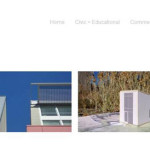
- Portfolio options.





“If you’ve got the goods, show them off.” always works! That Napa Poolhouse looked amazing. The nature was in harmony with the design.