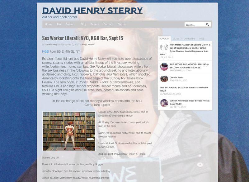
There seems to be quite the bag of tricks that went into building David Henry Sterry’s new site. Well, there is, but I’ll tell you what’s inside.
The more I use WOO Canvas, the more I think, “Well, that wasn’t so complicated.” With a smart collection of powerful and reliable plugins and Canvas’s own overflowing chest of power tools, what might look like a complicated and technical site didn’t have a smidgen of code … unless you count the RGB color numbers for the semi-transparent background for the content. (Update: and the bit to get the search bar into the nav.)
The video walks you through the steps and here’s a list of tricks and plugins used in David Henry Sterry’s wizbang new site:
- Justified Image Grid: posts in a grid just like Pinterest or Flickr. Add featured image to your posts, it’s ready.
- Background Manager: a powerful background tool that lets you have multiple sets of images for different pages on your site. Easy to work with. Unbelievable that it’s free.
- Semi-transparent backgrounds: check out #8 on WOO Canvas CSS Tweaks: Semi-Transparent Colors in WOO Canvas Elements. You can do wonders just knowing this little bit of CSS trickery.
- Business Slider Template: a WOO Canvas standard, but it all depends on the photos you use.
- WOO Tabs: these are always a favorite … especially if you have popular content with great imagery.
- Search bar in main navigation: yup, a little code in the right place and your search bar is out of your way–but useful.
Check out davidhenrysterry.com to see for yourself what Canvas, a few plugins, and some wild photography can do.

There’s a bag of tricks that went into building this site. But they’re not secret.


[…] How’d they do that? A tricked-out site demystified. (Sep 14) […]
Gorgeous and also very cool!