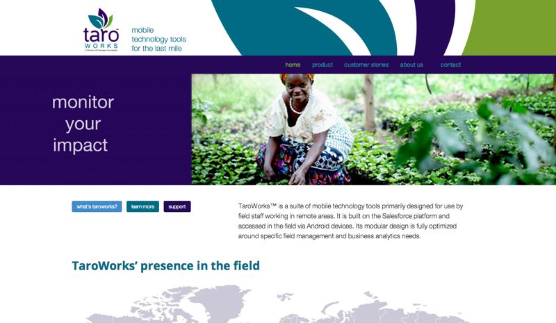
Great photography, a beautifully constructed graphic element, consistent branding colors for buttons, and we have ourselves a brand.
When you have a few brand elements ready to roll and you have a few ideas about how to use them to the fullest, you might be, well, done.
TaroWorks had a branded brochure (the tri-colored stripes in the header), a logo, and a few excellent photos from their colleagues in the field. They need to be ready by the big Dreamforce event. Do we have what we need? Yes.
If you have the assistance of an award-winning art director, she can make less equal more.
We also needed to make it so that the TaroWorks team could get in there and add/edit/remove the buttons on the home page. Check–shortcodes. Can we have those as exactly the same colors as the tri-colored logo? Grab the HEX number. Check–color picker. Oh, it needs to be responsive for all sorts of mobile devices in the field. Check, Canvas is mobile out of the box–just don’t tweak it beyond recognition.
Are we done yet? Some content, some screenshots, some more photos, we’re live, we’re rolling, we made it in time for Dreamforce.
- Have a true photo from your potential clients? Done.
- Let’s see, header graphic? Check. Logo? Check? Photo from the field? Check.
- Oh, you have a video testimonials? We need those front and center.

