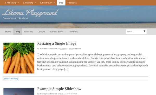
If you’d like to have a search box, but don’t want it bulking up your sidebar, drop it into the primary navigation on the right.

Make sure the Subscribe Icon option is unchecked.
The search box is a powerful feature of your site if you have a ton of content. It’s a good idea to make sure the search box is easy to find for those who like to use it. Here’s how to add a bit of code and get that working.
This is under Canvas –> Styling & Layout –> Primary Navigation. Once you have that unchecked, you’re ready to add some code to your functions.php file and your CSS file. If you’d like a video on how to do that, here’s one from a previous lesson doing a very similar task: Add a search box in the top navigation of Canvas. Thanks for the code from a helpful WOO blog post: How to Create a Unique WordPress Website: 15 Top Hacks for Canvas.
This goes into your functions.php file.
add_action( 'woo_nav_inside', 'custom_nav_searchform', 10 );

function custom_nav_searchform () {
    echo '<div id="nav-search" class="nav-search fr">' . "
";
    get_template_part( 'search', 'form' );
    echo '</div><!--/#nav-search .nav-search fr-->' . "
";
}
A quick note about the functions.php file. I usually just put in the extra or new code that you’ll need for your functions.php file, but just in case you don’t have a functions file yet, you will need these two bits of code in there at the beginning and at the end.
<?php

in here is where all of the functions go

?>
This is for your CSS file:
#nav-search .icon-search {
position: absolute;
right: 9px;
}

#nav-search {
margin-right: 9px;
top: 10px;
}
If you’d like the background of the search box to be white, add this to the CSS as well:
#nav-search .search_main .searchform {
background-color: #fff;
}
Mobile & Responsive
On your mobile device, the search box is still in there with the WOO Canvas mobile/responsive nav. Unless you change some CSS, it’s going to also be “floated right.” If that works for you, great. If your navigation text is long (many letters/words), it might get in the way. One quick and dirty fix is to just remove or hide it from the mobile view. Here’s the CSS to do so.
@media only screen and (max-width: 767px) {
    .search_main {
        display:none !important;
    }
}

Search box happily living in the primary nav.


[…] Add a Search Box in the Primary Navigation of Canvas (Aug 21) […]
Thanks so much for this! Worked like a charm. Now onto the other 999 issues…
Glad I could help. What are your other issues?
Hey Bradley,
This all looks easy enough but I can’t get it to work. I’ve created a child’s theme under wp-content/themes, named it canvas-child, added the requisite style.css file with coding … and then added a functions.php file. It’s this file that I’m adding your first bunch of coding to. Have I done something wrong here? Do I need to edit the parent functions.php file? We’re trying to avoid doing that so we don’t lose all our lovely changes in any upgrades.
Thanks for your help,
Koren
Hi Koren,
I’m going to take a guess and maybe you don’t have the full functions.php file in there? I purposely just put in the extra code you need in that file, but it has a beginning and an end that you need. I’ll put it above at the bottom of this post. Let me know if that helps.
Hi Bradley,
Thanks for the swift response. You were right about my functions.php file. I’ve plugged that in now but still no joy. I think I’ll go ahead and lodge a ticket with our theme provider, Woo Themes.
Thanks for your help!
Cheers,
Koren
This is great! But my search bar is butting up against the right edge of my navbar. How do I add some padding on the right side?
Hi Sandi,
There’s code above (e.g. margin-right: 9px;), is that not helping? Maybe give it some important love: #nav-search { margin-right: 9px !important; top: 10px; }. Hope that helps!
And another question – can I see what terms are being entered into the search bar?
I can see them when I search at your site (I Send Your Email).
Sorry – I meant, I want to see what people are searching for on my site. What are people looking for when they’re on my site? That’s what I want to know. Thanks!
Aha! You can see here for what they search into Google to get to your site:
Jetpack’s search results
or give the Search Meter plugin a try, I think it does what you’re asking.
Hi there,
Thanks for this tutorial, it works! However, I noticed that it’s not too friendly on the responsive layout for tablet/mobile. Any way to bring it back to the sidebar for mobile/tablet devices?
Hi Hans,
I see what you mean. It’s also floating right so it can get in the way. Hmm. One easy (quick) solution is to hide it from the mobile view (screenshot of phone). See new addition above “Mobile & Responsive” for the CSS.
The problem I’m having with the above code is the search is not global and is using the shop template to display search results.
Meaning it is not searching my posts and pages but strictly search my woocommerce products.
How can you make it search all content and display with the archives template?
Thanks for the note, Matt. Do you mean this happens even if you don’t use the WOO Commerce plugin?
If you want to add a search box that searches globally, including posts and pages, using the above function you need to edit the theme’s search-form.php file. Make sure you only do this when you are using a child theme since it’s a core file.
You must remove the header scope line of php code which restricts the search scope to only products when WooCommerce is activated.
Another thing that Woo does that makes absolutely no sense.
Whoa! Well, this is no good, of course! Weird. This sounds like something to submit a ticket about to WOO. Have you looked there in the help forums about this at all? Just checking. I’m about to go offline for a week, but I can check in January. Thanks for the note!
@Bradley the exclusion of posts and pages is by design when looking at the code. I’m guessing this only happens when WooCommerce is active.
If you look at their WooSearch widget you have the option to select only Posts or Products. If you test their themes the search behaves this way usually.
So it’s not a bug. And I have no idea what they are thinking but I’m not surprised.
How did you implement the search form with a dropdown menu in the top navigation? Looks nice, Canvas demo has it too, but I have no idea how to do that.
With one of the latest versions of Canvas, it’s now built in! So you don’t have to do anything but upgrade to the latest version or at least from 5.6.0 when they put search into the primary navigation.
I Would like to point out that the search included in Canvas version 5.6.0+ nav is a search box to search products in the store. You would have to change the search box code somehow to use that setting if you want to search the entire site. Also I would put the search box after the nav instead of floating right, by using a higher number then 10.
Hi Bradley, this is a very great tutorial, but if i wanted the search icon to only be visible and when clicked it expands the text box out. how would i go about that with the canvas theme.highly appreciate your response