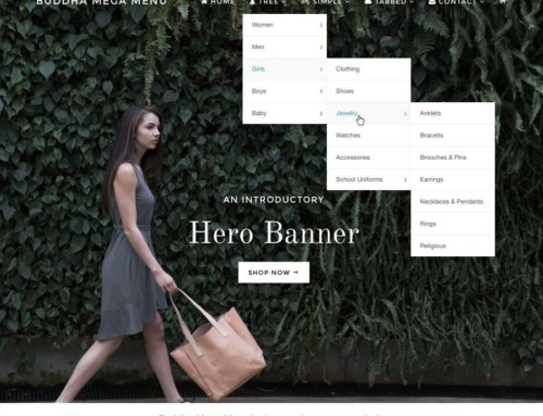
If your website is a supermarket, the primary navigation is even more important than those 2-column boards above each aisle. It’s more the big corner banners: Bakery, Deli … Exit.
The primary navigation (main nav, menu, etc.) is a very important element of your site. Here we’ll go over placement/layout, content, and style.

Is your navigation clear? Easy to read and easy to use?
Layout
The typical spot for a navigation is upper left, usually under a logo. It can also go top left, maybe top right, but it should be one of the first spots the eye will see as it scan a site: which is usually from top left to top right, then down, then back to the right–or a variation on that.
It should be easy to navigate and easy to read. It should also conform to some notion of standards. If you call your Contact page Ring Us Up! not everyone might know what you mean.
Content
What goes in your primary navigation? This is a hotly debated topic with answers ranging from “Everything” to “Almost Nothing.” From the SEO perspective, if every single page of your website links to all of the many links in the navigation, each of those links gets less weight. Think about going down the cereal aisle at the supermarket: there are so many choices you almost don’t know what to do. Unless you know where you’re going, know what you’re looking for and know right where to find it.
The other extreme is the minimalist content navigation. Something such as Home, About, Services, Contact. Hey, you know exactly what you’re getting. If you’re looking for their pricing, I’d bet it’s under Services. If you want to dig deeper, use search or maybe there are categories or a more robust navigation or site map elsewhere.
My opinion? I vote for the minimalist. I don’t really want people to get bogged down in my menu structure. I want them to follow through on my Call To Action (read an article, sign up for the newsletter, buy my product, etc.) or use search or just make it obvious to them what I think the’re probably looking for (read: this is what conversion optimization is all about). It’s all a balance: what do you want the visitor to do? Do you want them to go right to your menu? Or do something else?
Style
Bottom line is that it needs to be easy to read. If you can achieve that and make it look nice, well done. This is where WOO Canvas shines: styling the primary navigation has a tab all to itself. You can change the background color, the font color, size, font family (from a huge array of Google Web Fonts), vertical bars between the menu items or not, maybe even a semi-transparent color, drop-down styles … you get the idea. This is all without a scratch of code.


[…] Primary Navigation (Jun 14) […]