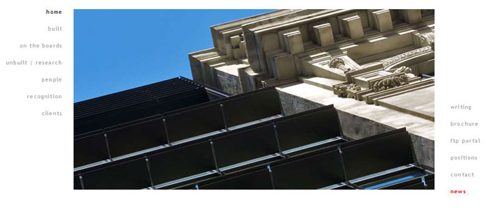
Charles Bloszies had a beautiful site, but it was in Flash. So they couldn’t update it (well, easily anyway). Good Looking Ideas and Likoma to the Flash rescue!
As architects tend to like, they wanted it clean and simple. We could do clean and simple. They wanted some features of their old site, but then update-able. Can do. Maybe even some 2- and 3-column shortcodes to let them in there, create the content, do some basic formatting and layout, and publish. No Flash, no fuss, no problem.
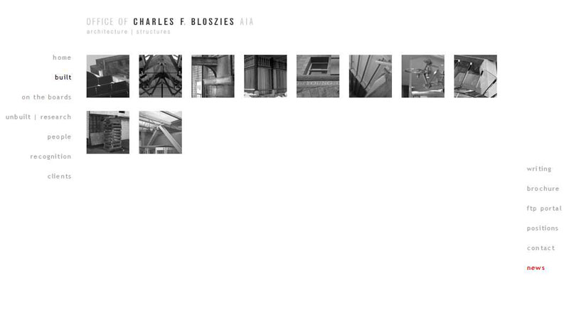
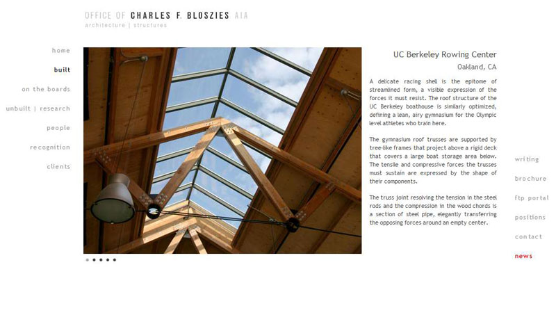
We built some really fun thumbnail/hover-over/fade-out/links/titles below pages that collected the posts from a certain category and then brought you to pages that showed off the photos for that particular project. Got all that? Here are some fancy thumbnail examples and then here’s the portfolio or image galleries.
In all, it’s a beaut of a site: powerful, sleek, but still clean and simple. Enjoy archengine.com.

