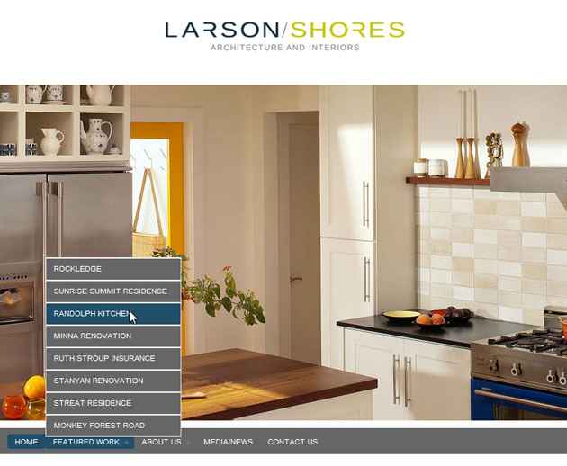
Josh Larson and Carrie Shores were looking to take their site to the next level. They knew what they wanted, how it should work, and what it should look like. Check out the newly constructed larsonshores.com.
They both liked the look and feel of sites built with clickbooq. I had never heard of it and checked it out. Beautiful sites! I’m happy to give any product the once over even if I’m specializing in WordPress. We got a 14-day free trial and I got in there to kick the tires. Photo management and slideshows were a snap and looked great. I think it’s all Flash based. But when it came to text, it basically suggests you create an image and make a link to go where you want (there were a few functions e.g. send an email). Ouch. I knew that they were going to want to put up news and maybe a blog, so a service that didn’t allow for easy posting and updates wasn’t going to work.
Enter WOO Themes Canvas. “Wait. Wah?” Yes, Canvas, living true to its name is a blank slate, a flexible framework from which beauty can emerge. I knew what they liked and the job was going to be to see if Canvas was up to the job. Well, of course, with enough custom coding, any theme can do just about anything, but the real trick, IMHO, is to make it happen and make it future friendly. What does that mean? That means to make it look great and work well. I don’t want to customize something to pieces only so that a simple theme update will break it into, well, pieces.
It became more a question of removing elements from Canvas rather than adding. Canvas is pretty bare bones to begin with so I had to get out the Exacto knife … But again, I’m just removing or hiding or moving around elements that exist in the theme without doing custom coding that will break with an upgrade.
For example, they wanted the navigation below the content. I found some help in the WOO forums moving the main nav below the content. Cool, thanks, done. But when viewing the site on an iPad or smaller laptop, the bottom navigation drop-down items fell below the screen. Bit of CSS magic and we have the drop-downs now doing “pull ups.”
We’re also using the fabulous uBillboard slider plugin for those slick (iDevice-friendly) sliders. Easy to manage and look great. Finally they wanted some text about the particular project on the same page but ideally using a peekaboo technology. WOO Shortcodes to the rescue. See how the Learn More opens up some text and then Learn Less closes it.
All in all, it’s a rocking site and I’m proud to say it was built in Canvas. Chalk up another for the powerful framework!


congrats on the site.
never heard of canvas but looks good. could you not do the same thing w/ StudioPress?
also imho nav would serve user better up top. I think running nav’s on bottom was used alot on fixed widow flash sites.
Aha, that’s the big question: can you do the same thing with WOO that you can with StudioPress. Just like the architect would say, “Of course we can build it, it’s just a question of resources.” I think it’s the same answer: use the tool that works best for you. Sure, StudioPress can build this site too,but what’s the best use of a theme for a site?
I love what you did with Canvas and moving the nav below the content! Looks great! I’m going to look up uBillboard, looks really clean.
Thanks, Danny! Yeah, I’m all about Canvas these days. It’s almost all I use. This site was pretty tricky getting that nav down there, but the site is worth it, looks great. Thanks for the note.
This is a great design. I will look up the CSS to move the navigation below the content. I’ve started using Canvas on two sites and love it.
Thanks, B.! Yes, this was a real winner and bit of a coup to get done in Canvas.
Hi guys,
I made this one in Canvas due to the flexible of the theme.
Hope you like it ;)
http://rubencio.com/
Nice and clean site, Rubencio!