So you have a logo or graphic and … that’s it? No worries.
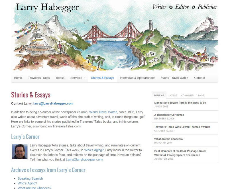
Larry Habegger”s site (larryhabegger.com) wasn’t bad before: header, colors, lots of content. Good, right? Sure. But then he got a hold of Candace Rardon and she created a graphic for him that made his life wonderfully more colorful … and his website developer’s life much easier.
We wanted to switch Larry’s hosting and as the techno jungle often has its way, we had to move fast. Then we realized we didn’t have access to the old theme. But we had the content. With WordPress, you’re OK that way: content and design are quite separate.
The DNS switched and we found ourselves with no design plans and some old content. The site was live. But there was the header drawing from Candace. We soon learned it was really all we needed. This would be the foundation for the design for the entire site. We could cherry pick colors (and even elements) of the sketch and use them in the site.
The same morning that the server switched we had the new graphic design up and running and Larry in there working on moving his content around. We were set. Round 2 design? Sure, we’ll get there, but when you start with something so well done and beautiful, the heavy lifting is done and we can sit back under the tree and enjoy the view. Check out larryhabegger.com.


