No logo, no color scheme, but wait, check out these book covers!
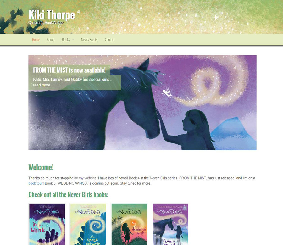
Kiki Thorpe (kikithorpe.com) has written dozens of books, but they vary from children to young adult. We didn’t want to steer the site design too far in one direction, so we pulled some of the abstract art from a cover and built it into her brand. The full-width header pulls a cropped close-up of a cover and brings color, warmth, and depth to her site.
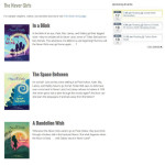
We dug through some Google Fonts and found some strong candidates to get her message across clearly. A nice calendar plugin gets her events lined up in the sidebar in an easy-to-read fashion. We have book covers lined up on a nicely arranged books category archive. In all, it’s a clean, professional site that’s just the beginning for her as she can now blog, update new books, and communicate with her fans.
- Stunning slider and books below.
- Books page with easy-to-see covers, titles, and excerpts.
- Event manager.


[…] Kiki Thorpe (Oct 19) […]