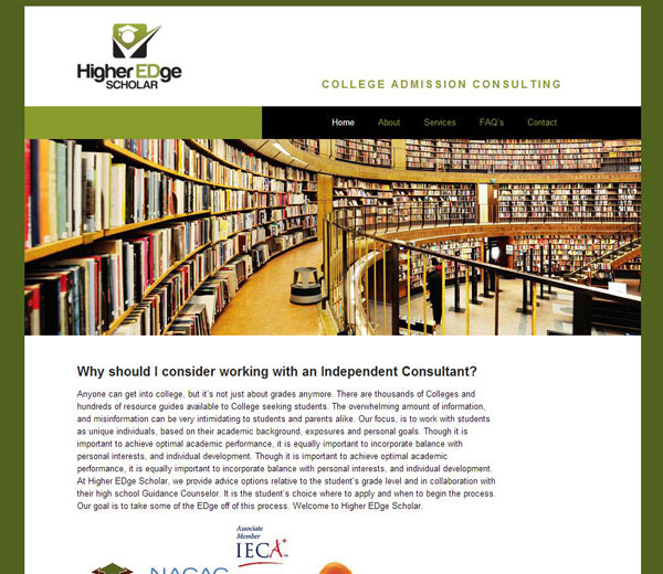
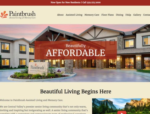
Clean, lean, green machine: A smart look for a smart business professional, Higher EDge Scholar now has a step up in their industry with this easy-to-navigate site. Good Looking Ideas is at it again: taking average sites and bumping them up to graduated status. She cleans out the clutter and gets to the heart of the matter with intelligent colors, graphics, and layout all working together to have a smart site.
WOO Canvas Flexible as Ever
It’s a good example of how easy (and powerful) the Canvas theme is. For example, if you’re familiar with the Canvas theme, you’ll know about the Business Slider. That’s what we’re using the home page. However, I thought to use the Boxed Layout for the site so the background can be the green but the content area white. Trouble was that Lauren wanted the navigation and footer to be flush with the edges of content. Hmm. I could use the boxed layout and then maybe reverse (negative values) the right and left margins for the nav and footer. Maybe that would work. But then I thought of setting the CSS for #content to a white background and then give it some padding. Trouble was that it would also give the business slider that same padding. Because WOO gives each page of their site a specific selector (e.g. .home or .page-id-34) I could say, in CSS, make the slider on the home page negative margins (top, left and right). It’s working beautifully. But the more I mess with the CSS under the hood, the more I’m disturbing the responsive design. This is why I like that I can turn off responsive design on WOO Canvas with a single line of code.


