WOO Canvas harnesses the design power of hundreds of fonts at your disposal.
Title in the header, widget titles, post meta font choices, page titles, heading 1, 2, 3, etc., there are so many places where WOO Canvas lets you choose which font you want to use it’s just plain nutty. But be careful in there, you can very easily choose too many fonts and lose any kind of design consistency.
In Canvas, as you’ll see in the video, you can preview what a font looks like, but only one at a time. If you’d like to see the full list of fonts displayed in real time, you can see all 600+ at Google Fonts.
Just a few short years ago, “web friendly” fonts were limited to a very (no, very) small group of fonts that was limited to the lowest common denominator of what people had available on their computers so a browser would have a better chance of reading it correctly. Good luck with that. The solution was to use images to make the text look like you wanted it–but then it was no longer text, of course, it was an image. Anyway, all old news. You now, in WOO Canvas anyway, have hundreds of stylish fonts that can do wonders (and blunders … ) to your site with a click, a choice, and a save.
Coming soon: an article by a graphic designer about how to choose fonts. Stay tuned!
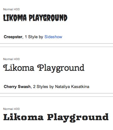
Whoa, 600+ fonts to choose from?



[…] Google Fonts in WOO Canvas (Oct 8) […]
[…] dug through some Google Fonts and found some strong candidates to get her message across clearly. A nice calendar plugin gets her […]
[…] used the hundreds of available Google Fonts to create a stylish page of content that otherwise would have been fonts + images = Photoshop (or […]