WOO Canvas is WOO’s flagship theme–and for good reason: it’s a powerhouse.
We’re on the lot, we know we want a car, we even know the car company, we’re ready to choose a car. Ready? If you’ve been following along in the series and the car analogy, here’s where we are:
- Website –> Transportation
- WordPress –> Car
- WOO Themes –> Car Company (e.g. BMW)
- WOO Themes Canvas –> Model (e.g. BMW 525)
Just like the BMW 525, at first glance, you might think the Canvas theme is a bit, well, vanilla. A boring but classy sedan. I think the WOO team consciously advertises it with a simple look so people aren’t disappointed when they install it and it doesn’t have all of the bells and whistles. But wait until you sit inside and have a look under the hood. She’s a beaut.
In case you’re just shopping on looks alone, here are a few quick links to sites built in Canvas:
As the name implies: it’s a blank slate, ready for your customization.
Everything is there ready to be turned on
There are so many features built into Canvas this post will be a mini-novella if I describe them all. As we build out WPU, we’ll get to them in more detail, but for now, even a list will give you an idea of the power and flexibility of Canvas.
- Layout: choose sidebar left, sidebar right, multiple sidebars, even change the width.
- Page templates: slider, blog, pages, archives, sitemaps, “Business” layout (large slider), “Magazine” layout (variety of layouts to view recent posts), etc.
- Responsive design: built right in, the site looks good no matter the device: smart phone, large monitor, etc. You can also turn responsive off.

WOO Canvas Layout Options
Layout
It used to be that if you wanted a sidebar on the left or right, you’d have to customize the CSS. Now it’s just a look and a click. You can choose to set the whole site in a certain layout or change each page individually. No sidebar, one sidebar, two sidebars. There’s even a Layout Manager where you can drag and resize the width of the columns.
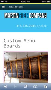
The WOO Canvas layout will adapt “responsively” to the device it’s being viewed on.
Responsive
Canvas is also a responsive theme. This means that it will adjust to the screen its being viewed on. On your mobile device (small screen) it will change the navigation into a more manageable system easier to push with fingers. On a large screen, if you choose the full-width header and footer for example, it will fill the width of that larger screen.
[box type=”note”]If you don’t want responsive, you can turn it all off with one checkbox. [/box]Keep in mind that if you tweak too much, you can “break” the responsiveness of the theme. Just like if you cut out your own sunroof in the car … chances are it’s going to leak–and probably not work all that well. Does that mean you can’t tweak the theme? No, it just means you shouldn’t go at the chassis with a welding torch.
[divider]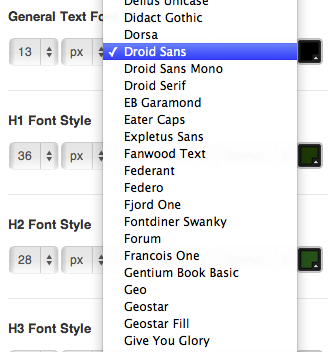
Need a font? Here’s a bazillion.
Google Web Fonts
There are plugins that can do this … but you could say that about quite a few of the features of Canvas. It’s built right in. Support for Google Web Fonts means that you have dozens and dozens of beautiful fonts to choose from to use in your theme.
[box]Ask your designer how important fonts are. Would you like a selection of 12? Or 120?[/box]Pretty much anywhere, too: navigation, header, sidebar titles, post and page titles, body, footer, etc. It’s just a drop down selection, font size, color, and boom, you just added what used to be a Photoshop job to your site with faster loading times and readability by both visitors and robots (Google) alike.
[divider]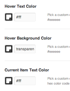
Colors, fonts, backgrounds, images, widget titles, it’s crazy how much you can change without touching CSS.
Element Styling Galore
Want that navigation a lighter shade of blue? Choose it on the color wheel. Maybe the footer a charcoal gray. How about those widget titles–maybe a border? Header background image? Upload here.
[quote]But why do I need my WordPress guru to change the color of the navigation for me? Exactly.[/quote]But there’s more. If you poke around, you’ll see just how much is on offer here. Hover text, hover text background color, current item text color … and this is just the navigation. Getting the picture? This stuff gets tricky in the CSS code, but you don’t have to get tricky or get into the CSS code. It’s all right here.
[divider]
A full-featured portfolio template.
A Fully-Featured Portfolio / Gallery
WOO Canvas has a built-in portfolio section complete with custom post types, AJAX-loading sections for each different “category” of your portfolio, then a single view page for each portfolio item with a built-in slideshow and thumbnails. Once you have it set up, it’s as easy (or easier) than adding a regular post in WordPress.
Check out Martin Sign Company’s portfolio page and click on those sub-categories of their portfolio and see how it changes on the fly.
[divider]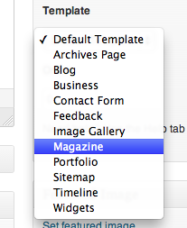
Slider, blog, images, contact, lots of options.
Page Templates
For each page of your site, you can choose from a menu of a variety of page templates. Page templates are custom designs and/or elements for a certain page. An archives page shows a date-based list of all of your posts. A blog templates sorts all of your blog posts and lays them out in a blog-friendly reading format. There are lots of choices and each one has its own special formats, styling, and layout.
The Business and Magazine templates are the most powerful. The Business template gives you several options of sliders, images and text as a slide or even video. The Magazine template is actually a collection of 3 ways to show your latest posts: a slider, a grid layout, and then a blog or list format. You can customize each of those 3 sections as you like to the point of even choosing the size of the featured image for each post listing.
[divider]The best part? It just keeps getting better.
The WOO Ninjas just keep updating, improving, and maintaining WOO Canvas. It’s their flagship theme by a longshot and it gets the most attention, updates and love. Canvas has the most posts (and answers) in the forums, the most updates to its changelog, and the most features. You can then add WOO Dojo’s features, WOO Commerce, any slider, plugin or styling you want and still under the hood you’ll know you have a solid foundation that will keep things oiled and working.
I could go on and on … in fact, I will. But I’ll add more posts listing Canvas’s features in more detail and link to them from this page. If you haven’t checked out WOO Themes Canvas, at least give it a look and compare apples and apples to what you were thinking of using. Chances are, Canvas can do the job–and then some.



[…] Why WOO Canvas? (Jun 24) […]
[…] This increase at WordPress U (wpu.me) was quite a surprise. This is my own project for my WordPress website design day job where I just want to have a place where my clients can get help with their WordPress sites. I’m not looking to necessarily fill the whole WP tutorial market, but I’d like my clients to be able to go here and figure out what they need to do. It’s currently quite specific to tools I use (e.g. WOO Canvas). […]
Hi Bradley
Canvas is a nice theme, but it would be nicer if it had more layout options, like iThemes Builder, Headway and PageLines DMS.
Have a good day;-)
Oliver
Thanks for the feedback, Oliver! But what, exactly, do you mean by Layout Options? Do you mean (1) body left + sidebar right, sidebar left + body right etc. or more (2) within a page (e.g. columns, widgets, more of a drag-and-drop interface? I know that iThemes Builder has more of a drag and drop, but I’m curious what you mean by Layout Options. On that note, I have a new post coming out shortly on the different permutations of layouts possible with Canvas.
Thanks again for the comment, much appreciated!
Hey Bradley
I mean, what’s needed is layout options in addition to the simplistic layout options given by default in most StudioPress and Woo themes. The world needs layout possibilities inside the content area, like Visual Composer offers. As well as full width page sections as offered via Headway’s “wrappers” and PageLines DMS’ “areas”.
Makes sense?
Yes, now I see what you mean. I haven’t used the plugins that can do the layouts within a WP page (e.g. Visual Composer), but I look forward to giving them a try. Do you have a favorite?
I don’t know (of course), but I can’t imagine WOO or StudioPress going this direction.
But I must agree, something like these builders could add tons of layout power to Canvas. Thanks again for the note, I’ll be looking forward to trying them out.
[…] picker. Oh, it needs to be responsive for all sorts of mobile devices in the field. Check, Canvas is mobile out of the box–just don’t tweak it beyond […]
[…] Keep in mind is that the hard part is figuring out those colors and the font and the logo and finding those images. Once you have all of that collected, getting it into Canvas is the easy part. Sure, you still need to make it work and know what you’re doing, but hey, that’s what we’re here for, right? Want to learn more about how Canvas might help you bring your colors and font and content into a smart-looking website? Why WOO Canvas. […]
[…] point, if you’ve been following WPU, I’m pretty happy with my choice of a single theme (WOO Themes Canvas). Is it the best theme? Is it the only theme? No, of course not. But it’s a good one. I also […]
[…] use Photoshop or Pixlr or something, but I thought what I wanted was so simple. Something that WOO Themes Canvas can do with […]
thanks for your post!
http://divi-mkm.com/