Lauren and Bradley are at it again. Whoa, talk about a transformation. Just set us loose on an old website and give us some leeway with colors, function, and design and we’ll knock it out of the park.
First United Lutheran Church needed a look that wasn’t, well, the look they had. They weren’t projecting a different, welcoming, “colorful” church. They got colorful. They got welcoming. Show me a church website with as much welcoming color as this and I’ll spell PHP backwards.
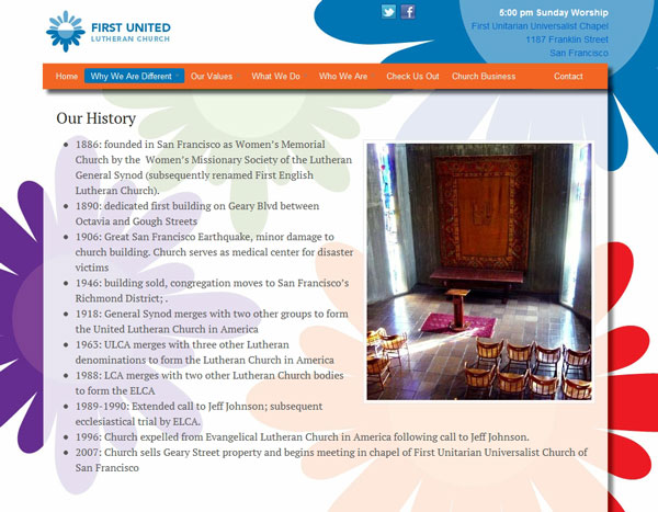
Lauren wanted those flowers in there, but they were going to flubber up the text. Hmm, how to have the best of both? I suggested a semi-transparent background and voila: readable text with a hint of flowery color. Solved.
Under the hood we’re sporting the latest greatest from WOO Themes: Canvas. My new best friend who’s the big boy on the block and he’s not backing down anytime soon. Flexible, powerful, and beautiful, what more could you want in a best friend?
Before

After
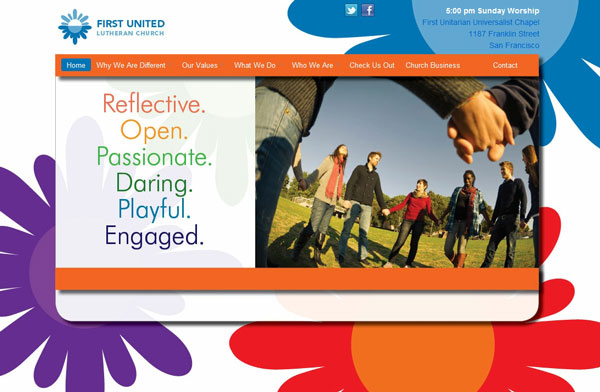
More after shots. Check out that semi-transparent content area. Tricked out some CSS for the boxed layout in Canvas.



Wonderful transformation!
Thanks, Pothi!
Whoa! The semi-transparent thing looks fantastic.
Nice work.
Great visual effect. Have you written up your CSS tricks for creating the semi-transparent effect on the boxed layout of Canvas? Just bought it from Woothemes and hoping to produce a similar effect for a personal site I am building.
Hi Mike,
It’s just a PNG file for the background of the main content area. I agree that it looks great, much thanks to Good Looking Ideas for that one.