Your potential customer just landed on your site. Now what?
It’s called conversion and in plain English it means, “What action do you want visitors to take?” There is a huge psychology around it and there has been volumes written about it, entire businesses devoted to it, but it comes down to making it easy for your potential customers to do what you’d like them to do.
You might think that you don’t care about conversion. “I just want them to read my articles.” Then you do want them to do something, you want them to read further. Or maybe you know exactly what you’d like them to do: buy your product, download your free e-book, sign up for your newsletter, retweet, like on Facebook, or just leave a comment. That’s one step: you know what you’d like them to do. But do they know what you’d like them to do? Is it obvious? Is it clear? Is the benefit to them apparent? All of these factors come into play.
When your senses are overwhelmed, it’s fight or flight. When those are customers, it’s going to be flight.
Let’s take the photo below. It’s a collage of products. Which one is the most important? Which one does the seller want you to buy? How can you find the one you want? Which one does what you need? How are you going to figure it out ?

When the choice is overwhelming, one choice is to choose nothing.
It’s not clear. In fact, it’s a mess and chances are, unless the buyer knows exactly what they want and how to identify it, they’re going to throw up their hands and leave. Online, that’s extremely easy to do: leave the site or page. How can you get them to stay? How can you help them choose? For one, limit the number of choices.
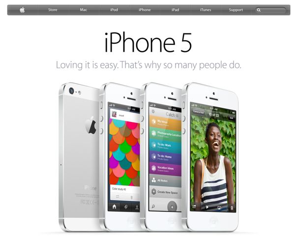
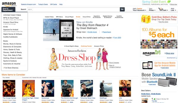
Below are two extreme examples of conversion optimization. You know them both well and you also know they’re doing quite well with their respective conversion methods.

A conversion optimization consultant’s dream: one clear choice.
One is extremely simple with a single product for sale. There is no question what they’re promoting. They only have one thing on the page (aside from the navigation). Simple, easy, clear, brilliant.
Let’s have a look at the other extreme.

Busy, lots of options, choices, buttons, highlights, and decisions to be made.
Amazon is taking the extreme other approach: show everything you’ve got, make sure no stone goes unturned, don’t say we didn’t offer that. Do they have different target audiences? Yes and no. Apple sells only technology, but lots of it. Amazon sells just about everything. But what is top left/center of Amazon’s page? The search field. They know you’re probably going to use that first and that’s fine with them. The other items are on the page for those who maybe don’t know exactly what they want.
Chances are your site (or shop or products) falls somewhere in between these two extremes. What can you do to make the decision process easier? How do you get the visitor converted to a buyer who actually goes through all of the steps of deciding, choosing, paying, and receiving your product? There are so many factors to consider: price, placement, relevance, timing, mood, ease of the process, and plain old luck. How can you optimize all of that? How can you convert more visitors into buyers, members, or what you’d like them to become?
Focus
This will be the first in a series of conversion tips, so let’s focus on … focus. See the muffin and cookie above? No question that you’re in a bakery. You have two choices. Make one. But the boxes of oddly collected drugs? Does your website resemble the baker’s or that hodgepodge pharmacy? You want to tell your customer, “Focus!” but is it their fault? If you put them in front of the boxes of pills and said they had 5 seconds to choose, they’d probably just dig in and pull out whatever they grabbed first. They might as well do it with their eyes closed. But the cookies and muffins? Easy … both. ;-)
Stick around, this is the fun stuff. Oh, did you want a button? OK, OK, here’s your button:
Want more like this in your inbox occasionally? Sign up with one click below.

![It's going to be one or the other ... or both. [Thanks to Flagstone Pantry for the baked delights.]](https://www.likoma.com/wp-content/uploads/ptsc-107-cookie-or-muffin.jpg)


[…] Want to learn more about it? Hot off the presses: Conversion Rate Optimization 101. […]
[…] Conversion Rate Optimization 101 (Apr 10) […]
Awesome post, didn’t know that conversion is so important in business.
Hi Jewel,
It’s funny, it’s only important if you care what your visitors do or if you have something you’d like to sell or promote or something you want them to do: e.g. sign up for a newsletter. Otherwise, it’s not important. Does that make sense?
[…] or just make it obvious to them what I think the’re probably looking for (read: this is what conversion optimization is all about). It’s all a balance: what do you want the visitor to do? Do you want them to go […]