Lauren Deane

Lauren Deane does smart, pretty stuff. She’s going to take your site (or logo or brand) to the next level by thinking broader, higher, smarter. She’ll have a reason to her decisions–and you’ll probably like them. She’s not just another pretty typeface.

Higher EDge Scholar

Here's a good example of how easy (and powerful) the Canvas theme is. What looks like a simple design is actually a bit tweaked to keep it, well, simple.

Neetu Ahluwalia

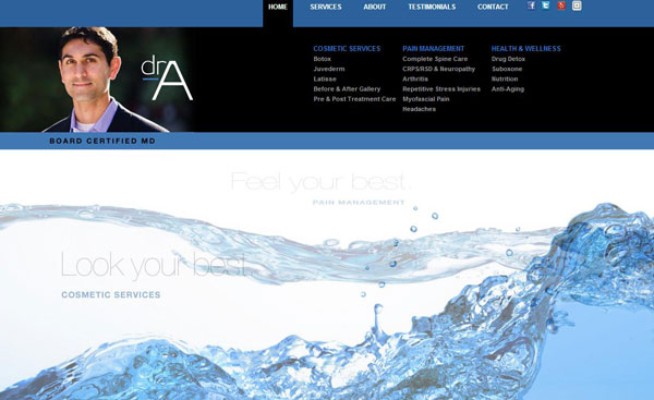
Neetu Ahluwalia "Dr A." didn't want to look like every other doctor's site. I think we got that covered

Stephen Gandy CFP

Lauren, Mischa, Gil and Bradley team up to create this clean and smart site for a local financial planner.

FunctionOne

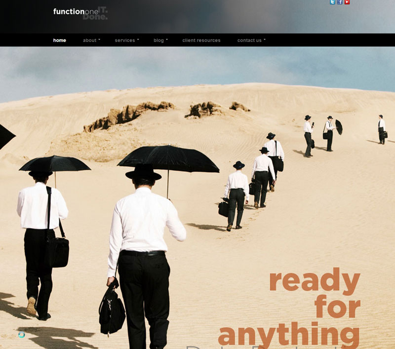
What do you get when find a super tricked-out theme at ThemeForest? Don't judge a book by its cover.

Adaptive Technology

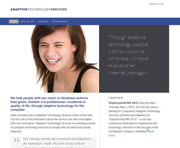
Adaptive Technology works with blind people, so we needed to make sure their site would be "JAWS" friendly. Does WordPress pass the screen reader test? So far, so good.

First United Lutheran Church

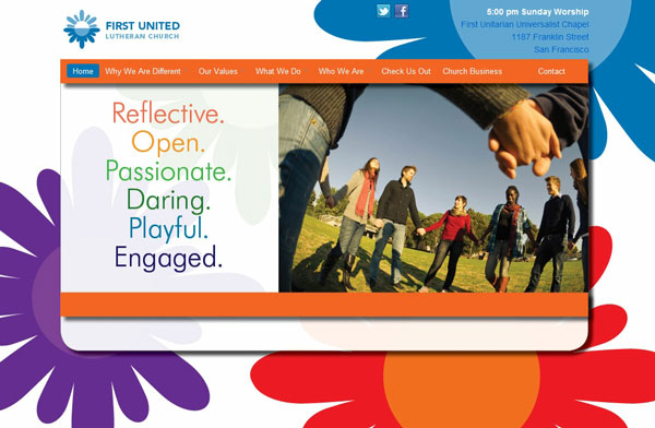
Lauren and Bradley are at it again. Transforming a whole lotta nothing into a gotta-have-it something. And this is a CHURCH website.

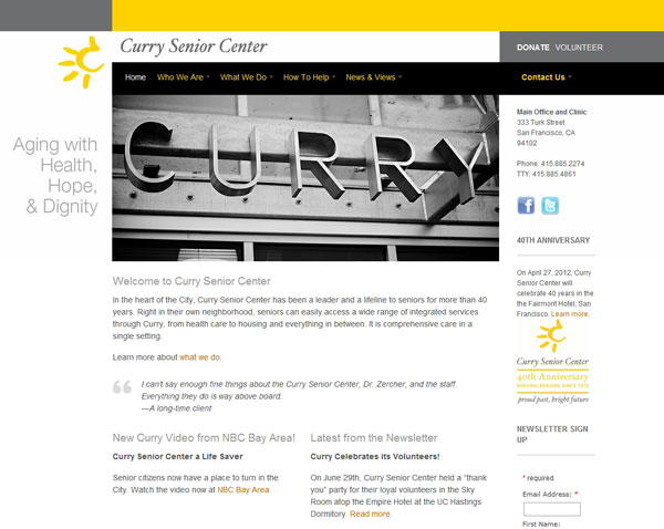
Curry Senior Center

Not bad at all: nice images, lots of content, good navigation. Hard to beat, but with WOO Canvas and Slider Pro, it sure makes the job easier.

Warren Law Firm

The Bradley, Lauren, and Gil Trio of Triumph are at it again with another crispy clean (did someone say Krispy Kreme?) site with style and targeted content. Woo!

Ackerman Realty

Craig Ackerman is a high-powered San Francisco realtor who needed a high-powered real estate website. Good Looking Ideas and Likoma teamed up to rock it.

Pivotal Consulting

Adrienne Dale of Pivotal Consulting needed a professional site for her top-notch technology consulting business.

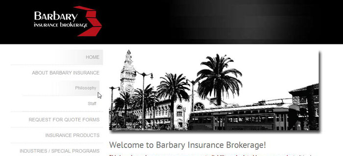
Barbary Insurance

With my recent infatuation with StudioPress' Genesis Framework, I thought I'd try to see if I could do what Lauren wanted--a non-Genesis theme--with a Genesis theme.

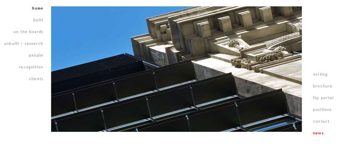
Office of Charles F. Bloszies

Charles Bloszies had a beautiful site, but it was in Flash. So they couldn't update it (well, easily anyway). Good Looking Ideas and Likoma to the Flash rescue!

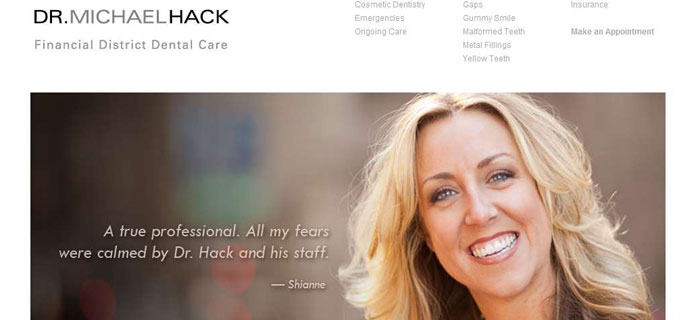
Financial District Dental Gets New Front Teeth

Dr. Hack is no strip-mall dentist, he's a professional artist who loves his craft. He needed a cosmetic--and general--upgrade to get his business to where it should be: at the top of the game. We did that.

Revision Design Studio

Nancy Bramwell's design studio needed a place to show off her portfolio of window treatments, staging and color consulting. She wanted to showcase her services--and do it in style. We found a beauty theme together at ThemeForest and we were off to the races.

Go to Top