If you’ve upgraded to Canvas 5.5 and later, you’ll notice there’s a great new business slider. But they killed the left-aligned title and description. Here’s how to get it back.
[box type=”info”]This only works in the non-full-width version of the slider. [/box]
See below for the old way the title and description were aligned and the new slider. To get that old alignment, there’s some CSS below that you can put in your Jetpack Custom CSS and you’re all set.
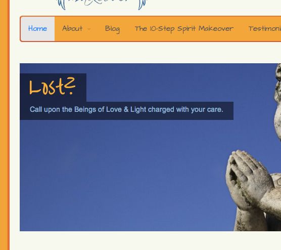
In the old slider, title and description was aligned left. With a little CSS, you can have that again.

Title and description is either none, bottom, center, or full.
#loopedSlider.business-slider .content {
	background: transparent !important;
	padding: 0;
	top: 20px;
	left: 0;
	margin: 0;
	bottom: auto;
}

#wrapper #loopedSlider.business-slider .content p {
	background: #000 !important;
	background: rgba(0,0,0,0.5) !important;
	display: block;
	overflow: hidden;
}

#loopedSlider .content .title {
	background: #000;
	background: rgba(0,0,0,0.5);
}



[…] Left-Aligned Title and Description in WOO Themes Canvas Business Slider (Nov 27) […]
[…] (10) Duh, if I were more updated on the changelog, I wouldn’t have needed this post at all: Left-Aligned Title and Description in Business Slider. […]