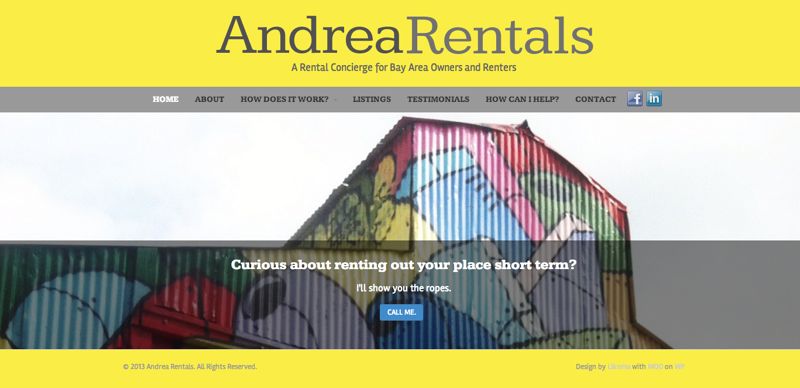
We’re taking full advantage of the design powers of Canvas. All off the shelf, ready to implement.
We opted to use many of the graphic options that come out of the box in Canvas–they just take some creative direction. If you have the creative direction, Canvas can come through with responsive, easy-to-edit, and great looking design elements.
Andrea wanted to:
- Use graphic elements (colors and boxes) of some kind to liven up the text.
- Try to not use Photoshop (so that she could edit the copy later).
We picked from the hundreds of available Google Fonts to create a stylish page of copy that otherwise would have been fonts + images = Photoshop (or some other fonts plugins). We also used the out-of-the-box Canvas Business Slider for the home page to show off the panorama images. We added a title, tagline, and a button for a call to action. Even that simple button is editable: text, color, size, light font, dark font, etc.
It’s a great looking site that also, thanks to keeping away from images built in Photoshop, is responsive so it looks great on all dimensions of screens on different tablets, laptops and regular browsers.


