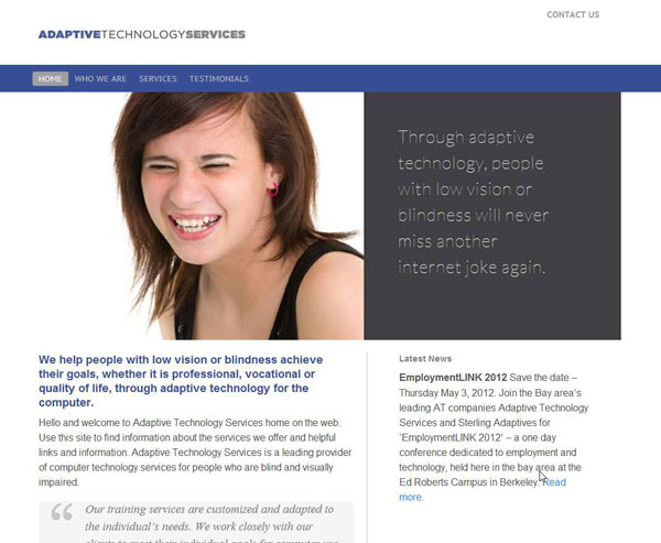
Adaptive Technology works with blind people, so we needed to make sure their site would be “JAWS” friendly. Does WordPress pass the screen reader test? So far, so good.
They had an HTML site that could be updated in a simple process: (1) Edit HTML file, (2) upload. That is, of course, if you know how to edit an HTML file or can find and it and know how to upload and/or have the FTP information to do so. They hadn’t updated their site in ages because no one really knew how to do it–or had the time. Or both.
They also wanted to convey a more professional image. They are a leader in their industry and needed a website to show it. Enter Good Looking Ideas for a design makeover. On the surface, it might seem easy to improve on a blue background and white text as the entire design of the previous website, but on the other hand, it’s a bit like starting with a blank slate–or maybe even more difficult. Lauren scoured photography for, well, ever, and found the images that were going to make this site sing. We also needed to be careful to not have text in images as (pure) text is better for screen readers. We used the Slider Pro plugin which allows you HTML in the slider so we could keep text on the home page–not bad for SEO as well. It almost goes without saying that we’re going to use WOO Canvas so we have all of those powerful tools in the shed that we can pass onto the client for ease of use in changing all kinds of features.
So together with Lauren, WOO Canvas, and Slider Pro, we have another winnah winnah here with Adaptive Technology.
Before
After


I’m quite familiar with screen reading applications like JAWS for Windows and NVDA. They work really well for the user when things are presented to them correctly on the web but man oh man does the fun start when the coding in a web page has gone way outside industry standards, FaceBook’s main site being a perfect example. I’m glad to see that there’s someone out here that has a clue as to what they are doing with reguard to this stuff. Awesome! Rock On!