I fell for it: a client wanted to use a shiny new theme.
I checked it out, it has a bazoollion sales, great reviews, tons of features. The whole nine yards. There must be a catch, right? There’s got to be something wrong with it, otherwise, not so many people would buy it. But wait a sec, why are so many people buying it? Is there something there? Am I the one missing the boat?
Are we missing the boat by sticking with “what we know and know well”?
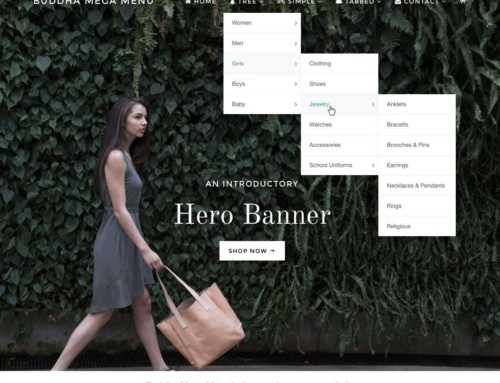
Below is a screenshot while just playing around with the them. You can overlay text on a video, sorry, let me rephrase, you can extremely easily have a video as a background of, well, pretty much anything you want. Then you can change the opacity of a color (of your choice) in the case you’d like the text to be more readable. Uh huh, so where’s the catch? Do you know how much coding this would take to make this from scratch? It’s not even worth the bother.
Before I go nuts and use it everywhere (who would do something so “eggs in one basket” like that!?), I’ll give it the full run of working together with the designer and see how it fares.
One thing I already miss from Canvas: I can’t make the logo just text. It has to be an image. Yeah, uh huh, that’s like not liking the Ferrari because the spark plugs have a purple stripe on them.
I’ll keep you posted.


