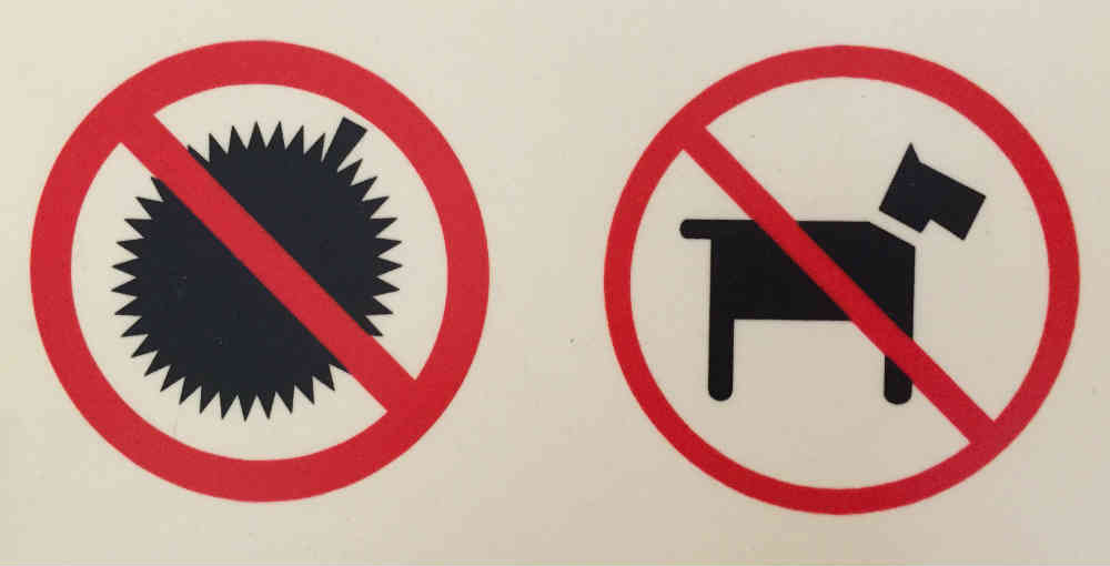
You’re in a small slice of the population if you know what’s not allowed–other than a dog.
Is it a bomb? That would make sense–not allowed! How about a blow fish? Maybe a prickly pear? Balloon? By the way, it’s so well known that there were no explanatory words accompanying the sign.

You know what your logo signifies. But do your potential customers?
In certain parts of the world, people really don’t want you bringing this thing into their hotel or shop or, well, anywhere other people are. I love dogs, but many establishments don’t want them admitted because there are others who don’t like them. But the object on the left? I think it’s almost universal that people don’t want anyone else to bring it in.
How clear is your logo? Or messaging? Or design? Or marketing?
Do people not know what you’re trying to get across? Maybe your direct target audience, but what about those who might be a potential audience? If it’s not clear to them, is that intentional? Or maybe you’ve worked through the economics of the idea that a part of the potential audience really might not know what you’re trying to sell or offer or promote.
What if people didn’t understand your signage or logo to the point where it was even detrimental to your business? Or take this sign: what if people brought in what they thought was OK because it wasn’t clear, to them anyway, what was supposed to be conveyed in the sign design?
Don’t know what the thing is? You might be surprised: you don’t want to be near this stuff … unless you’re eating it.
- 10 Common Mistakes In Logo Design
- What makes a good logo?
- A Good Logo Says A lot…. A Bad Logo Says More
I’m happy to introduce you to our design contest site – a competitive platform that allows people from all over the world to get or provide the unique logo design – customers’ and clients’ first glimpse into brand’s identity.
You can see it for yourself here: https://www.designcontest.com/


[…] You know what your logo signifies. But do your potential customers? (Jul 17) […]