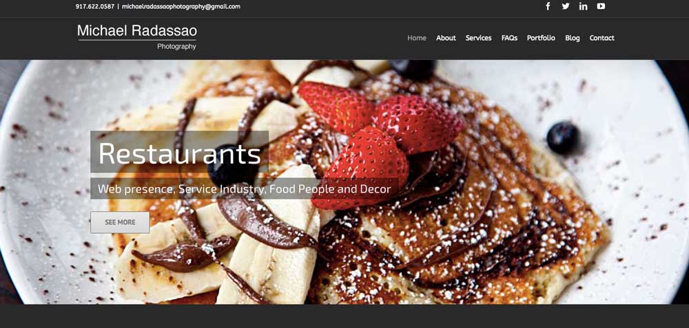
Showing off his work with sliders and portfolios.
If you have excellent photography, let the images do the work–not the WordPress theme.
Michael Radassao displays his beautiful work effortlessly with easy-to-use sliders for the home page as well as a portfolio section, a space for a blog and customer testimonials.
His previous site worked well in WOO Themes Canvas, but with the Avada WordPress theme, we’re taking it to the next level. The home page has parallax effects, scrolling long page where we can introduce Michael and his work and then lead off into sub-sections to dig deeper into the photography.







Fascinating to be charging clients starting at $2500…using Avada (a bells & whistles top-selling Theme)…without even bothering to change the default font Avada comes with. Or in the case of your website, not even bothering to customize Avada’s default colors, fonts, header, shortcodes etc etc. default. What level of customization is going on here?? none, in my opinion