I’m sometimes asked how to format a WordPress website to display nicely on mobile devices like an iPhone or Blackberry. This is an important question because mobile browsing is becoming more mainstream, and not all website elements translate nicely for mobile browsers (such as Flash not working on an iPhone).
Lee Foster (photographer and writer for Foster Travel Publishing) asked how he could best optimize his site for mobile devices. I briefly told him that he could either (1) do nothing and just leave the mobile viewers to see his site as non-mobile browsers see it or (2) use a WordPress theme (via a plugin) specifically made for mobile devices. There are pros and cons to both.
(1) No custom/special theme for mobile users
Advantages
- Site usually looks like the original site.
- Same navigation that visitors are used to.
- Visitors know where content is and how to get to it (via navigation and layout).
Disadvantages
- With no Flash on the iPhone, certain features might not work (slideshows, Flash movies, etc.).
- If a complex layout (e.g. drop-down menus), can be difficult to navigate and even see.
(2) Mobile WordPress theme
Advantages
- Button/switch at bottom of screen that allows visitor to switch back to non-mobile version.
- Navigation (theoretically) easier (with fingers on touch screens).
- Content easier to find.
- Content easier to read (type is adjusted to fit mobile screen).
- Easy to install via a plugin (e.g. WP Touch)
Disadvantages
- Site loses the style and layout of the regular site.
 I asked my SEO Pro colleague, John Muldoon of The Watermark Group, his opinion. He noted that, according to Google Analytics, only 5% of Lee’s traffic was using mobile browsers.
Lee notes, “However, one loses totally the look and feel of my site.”
And it’s true: the site is no longer Lee’s style, color, and layout, but a collection of content. So what does the user want? What’s going to help the reader navigate the site and get to the content they want? On a mobile device, do people care really what it looks like or are they just looking for the content and need to move on–and not miss their metro stop?
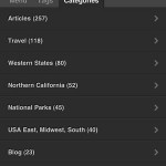
Below are some screenshots from Lee’s site, both with and without the mobile theme. See that the mobile theme does have some nice features (search, tags, categories, and specific pages). You can configure these in the plugin John chose (WP Touch) in your WordPress admin settings for the plugin.
Do you have experience with WordPress mobile themes? What are your favorite themes/plugins? What have your audiences said about them?
I couldn’t help it, but as I was looking through Lee’s photos, I had some favorites. He’s allowed me to put a few of them here. If you’d like to see more of Lee’s photography, head over to Foster Travel Publishing.


Bradley, this post is so good! One more reason to adore WordPress.
Thanks for writing this up.
Are we talking “free” or the “pro” version
This was the free version.