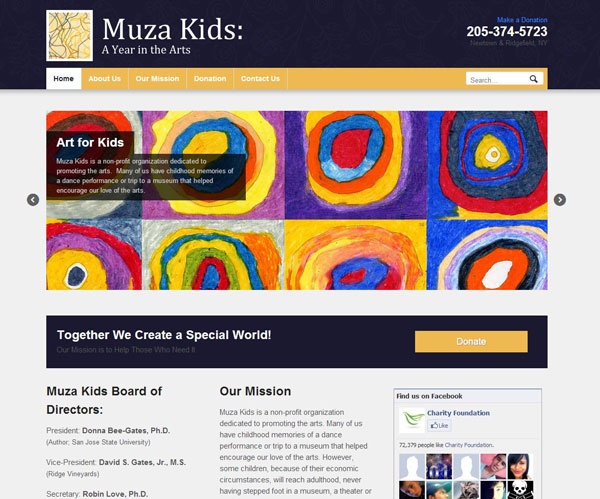
What can you do with a few colors and a few photos? Lots.
We put together a nice site for Muza Kids, A Year in the Arts. It sports a clean navigation, clear logo and tagline, and they can use their home page slider to add featured projects. The home page is divided up into easy-to-use columns (easy for the user and easy for the visitors to the site). Nicely embedded Facebook widget in the right sidebar. PayPal donations is set up so they can collect funds for future projects. They’re ready to roll.


